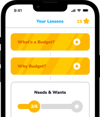
Save for the Future!
Role
Concept, Research, Visuals, Prototyping
Duration
Aug - Sep 2021
Tools
Figma, Illustrator, Photoshop
Type
Mobile App
The Problem
A lot of people don't know how to properly budget themselves. These people may eventually or currently find themselves in debt that can dictate the rest of their lives. Some of this group may have never been taught how to budget or never been taught in a way they can understand.
The Goal
Create an app that will educate on budgeting and help people learn how to save for the future. Focus on teaching at a young age as a preventative, but still be useful enough for an older generation. Gamify the learning experience to make it more enjoyable and easier to keep a habit of continue use.
Competitive Analysis
An audit of a few competitor's products provided direction on gaps and opportunities to address with the app. Each of the competitors allowed the users to set up a budget, except Duolingo which is a language learning app. YNAB, Nerdwallet, and Intuit Mint are all budgeting apps that focus on that task only. They have a few features to alert you to certain things to help you with your budget, but you'd need to know how to budget to begin with to really get the full effect. Duolingo has an fun and interesting take on learning languages that I felt could work in a similar way for budgeting.




The Users

Stacey 15
Highschool Student
Lives with her mom and brother
Stacey is a high school sophomore who wants to learn about budgeting to help her family save up for her future because her family is not currently financially stable.

Joey 22
College Student
Lives with his dad
Joey is a college student reaching the end of his studies who wants to learn about budgeting to be able to live comfortable while still paying off his student loans.
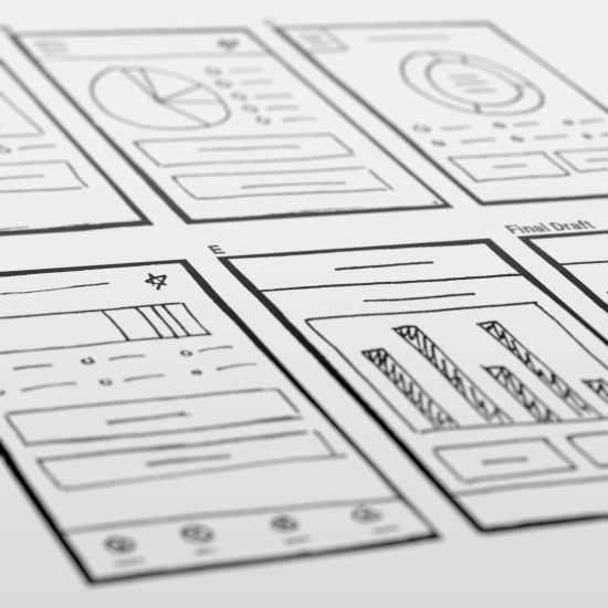
Initial Design Sketches
For the main budgeting page there were many draft iterations to discover the best layout suited for the users.
Wireframes
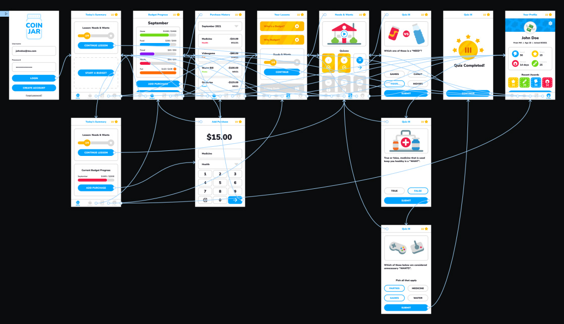
After ideating and sketching, I created the initial wireframes for the app. These designs show the entire user flow and allowed for initial user testing to futher improve the the project.

User testing results
I conducted two rounds of usability studies. Findings from the first study helped guide the designs from wireframes to mockups. The second study used a high-fidelity prototype and revealed what aspects of the mockups needed refining.
Lessons and Quizzes
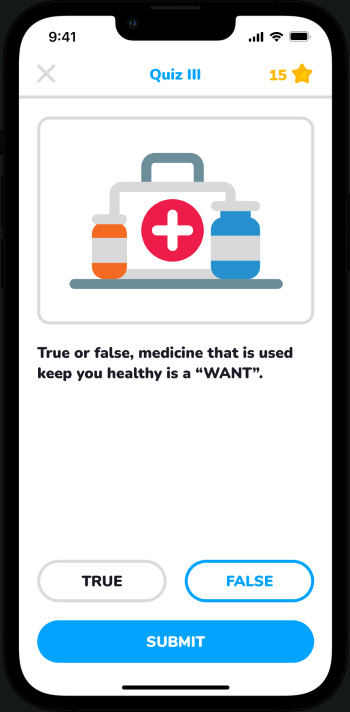
The main feature of this app is to teach budgeting lessons to the users. Each lesson has an informative video about the subject along with several quizzes to work through. The quizzes are structure with simple multiple choice answers to allow for quick and easy learning.

Budget Summary
After learning about budgeting it's good to use it in practice. This app allows the users to input purchases, organize categories, and set limits to visually show where money is being used. For users who may not currently have a need for a strict budget can use a generated budget example to follow the processes they've learned.
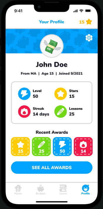
Profile and Progress
Profiles allow users to track their progress throughout the lessons. Awards are given for certain milestones to gamify the learning experience and encourage continued use.
Conclusion / Next Steps
Designing this app was very fun! I loved creating a more playful aesthetic with the icons and colors. For next steps I'd like to conduct more user research to determine any new areas of need, add more lesson and quiz types, and give a go at creating animated scenes for each of the lessons and quizzes.