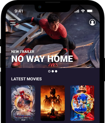
It's Showtime!
Role
Concept, Research, Visuals, Prototyping
Duration
Aug - Sep 2021
Tools
Figma, Illustrator, Photoshop
Type
Mobile App
The Problem
The entire process of a movie theater takes a lot of time, much of which involving waiting in lines. It can take even longer for yourself and others if you're indecisive. One example being trying to pick a snack you'd like for the movie but are unsure which one would be best for your specific dietary needs.
The Goal
Create an app that streamlines the entire process by letting you to select your tickets, seats, and snacks ahead of time and allowing you to skip all the lines. Also add more detail to help the users along the way such as adding nutritional details about each snack, available accessibility options, and a theater map.
Competitive Analysis
An audit of a few competitor's products provided direction on gaps and opportunities to address with the app. Each of the competitors allowed the users to order movies ahead of time, except Netflix which is a streaming service. AMC allows the users to order snacks ahead of time, but you'd have to do your own research for nutrional information. Fandango has the benefit of ordering from several theater chains, but only allows movie tickets.




The Users

Jason 38
Manufacturing Engineer
Lives with wife and 2 kids
Jason has a fairly heavy workload and usually comes home late most days. He tries to make the best of the time he has with his family. His wife usually does all the planning, but he wants to be more involved on that front. His kids can be a bit difficult at times when it comes to getting ready for things.

Noel 24
Freelance Photographer
Lives with 2 Cats
Noel has a pretty busy life being a freelance photographer. She's usually talking to someone about an upcoming project, but still finds the time to get together with friends and plan things to do. She's also always on the lookout for healthier options to food to maintain her health and looks.
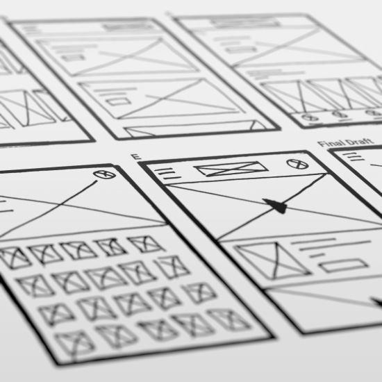
Initial Design Sketches
For the homepage there were many draft iterations to discover the best layout suited for the users.
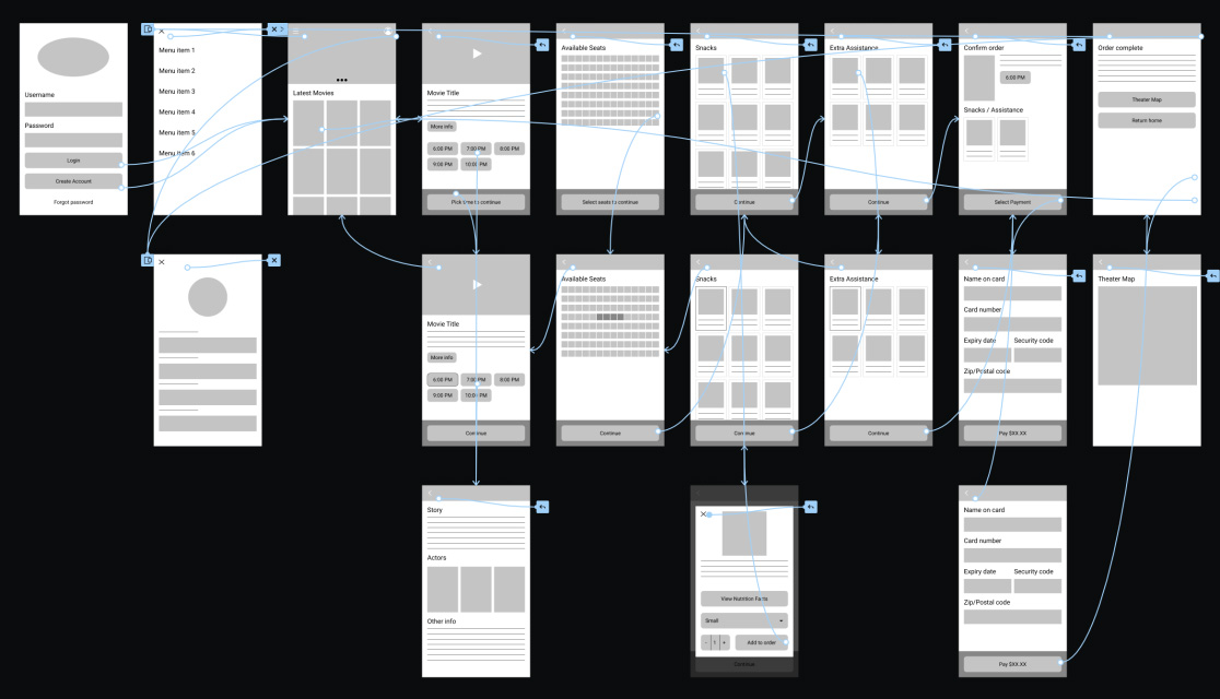
Wireframes
After ideating and sketching, I created the initial wireframes for the app. These designs show the entire user flow and allowed for initial user testing to futher improve the the project.
User testing results
I conducted two rounds of usability studies. Findings from the first study helped guide the designs from wireframes to mockups. The second study used a high-fidelity prototype and revealed what aspects of the mockups needed refining.
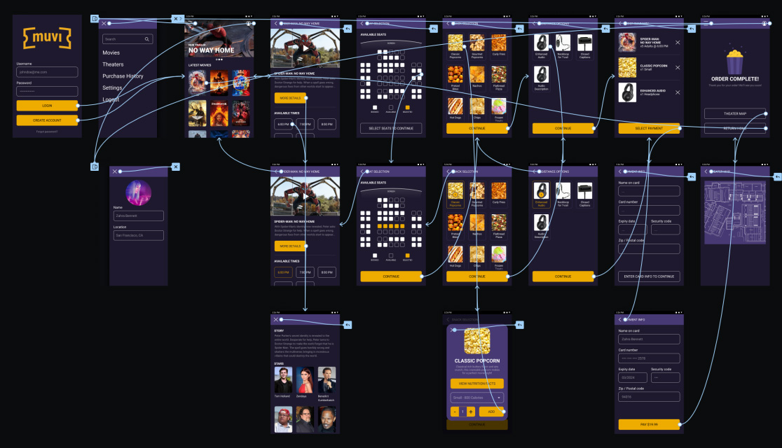
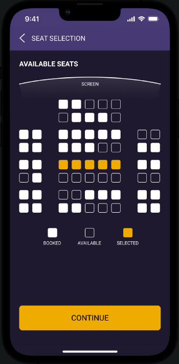
Ticket and Seat Ordering
The main feature of this app is to allow the users to purchase tickets and pick seating ahead of time. This enables the user to skip the lines at the theater and go straight to their movie.
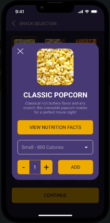
Snack Details
Most theaters don't have nutritional information available at the ready, and it's even worse when you're trying to make a decision while in line. This feature allows the user to see important information about the available snacks and make a decision before even getting to the theater.
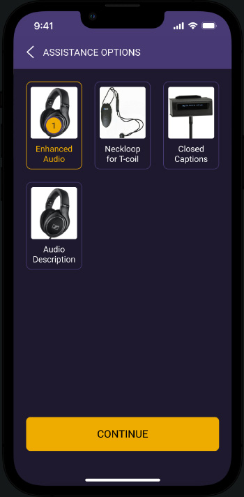
Accessibility Options
A lot of theaters have accessibility options, but you have to ask for them. This feature allows the user to see the available accessibility options, add it to your order, and have it ready for you to pick up when you arrive.
Conclusion / Next Steps
Designing this app was very rewarding! This is the first project I've started with Figma and I'm loving the interface and features it has. For next steps I'd like to conduct more user research to determine any new areas of need, add more customization options to the app itself, and allow users to directly comment on movies and trailers to build a community.